 What's New in Version 3
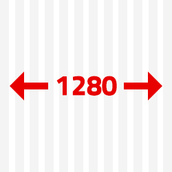
New size „medium“ for correct display on tablets
The most important change affected Grid section. For correct display of website on smaller devices such as e.g. tablet we added medium size (classes „m-1 up to m-12“). Thanks to this new size you can display content on desktop in 4 columns, on tablet in 2 columns, and on mobile phone in full width of screen.
read more >
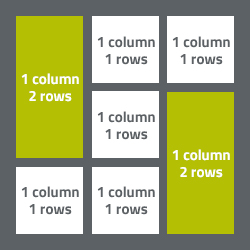
Offset of columns
Another supplementation of the framework is addition of option enabling offset of column from the left side. Thanks to it you can distribute content to columns in such way the first column is offset from the left side by width of one column. In three-column layout you can also align one column to the left, the other to the right and leave free space with identical width of both columns between them. The offset you can adjust especially for all three sizes of grid (s, m, l).
read more >
Responsive Tabs
Wonderful innovation is Responsive Tabs, thanks to which you easily distribute the content to particular sections without necessity of switching among sub-websites. Responsive Tabs have well-arranged structure and their activation is very intuitive and simple.
read more >

Images
We modified CSS rules for images so that they automatically adapted to width of container in which they are located only in so far their width did nor exceed their real width.
At the same time we added a new class „full-img“, by means of which a image adapts to full width of container in which it is located regardless of real width of the picture. A image with this class will behave equally as it was in previous versions of Responsee 1 and 2.
read more >
New template
Completely new template named One Page comes together with new edition of Responsee. As the name itself suggests, it is single page website. You can look forward to excellent design with implemented innovation of Responsive Tabs, and as usually, fully free of charge! We also upgraded all the other templates for Responsee 3.
read more >
Automatic closing of submenu
Navigation was improved either. We added automatic closing of submenu in case a user clicks on another item of the same level. The modification applies to side navigation and mobile version of main navigation (horizontal navigation).
read more >